


This well-designed pharmacy-cosmeceutical hybrid store merges clinical credibility with retail warmth, creating spaces where customers feel both confident in medical advice and relaxed while browsing skincare products.
Modern pharmacy-cosmeceutical stores achieve this balance through Japanese-inspired minimalism, layered lighting systems, durable hygienic materials, and modular display fixtures that accommodate both pharmaceutical precision and cosmetic appeal. This design approach reduces customer anxiety, increases dwell time, and drives cross-category sales.
Let’s explore the six core design elements that make this dual-function retail concept successful.
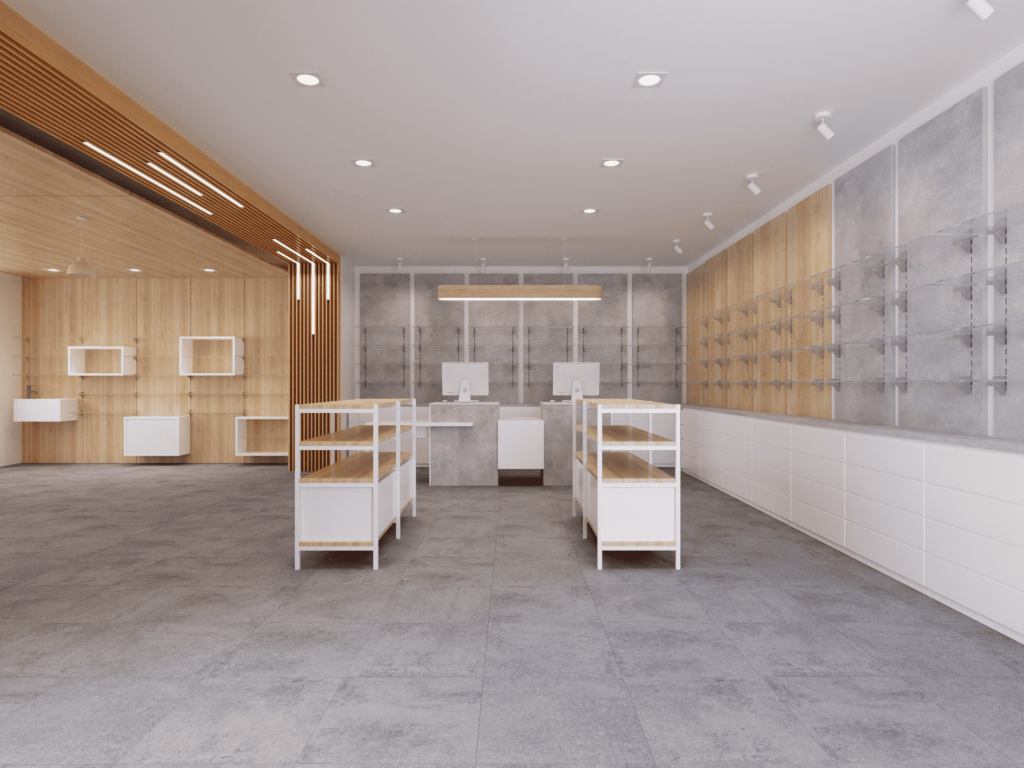
1. Custom Design Creates a Unique Brand Identity for Hybrid Retail Spaces
The foundation of any successful pharmacy-cosmeceutical store lies in its ability to communicate two distinct brand promises simultaneously: medical trustworthiness and lifestyle aspiration. Traditional pharmacies often feel sterile and intimidating, while pure cosmeceutical retailers may lack the gravitas needed for health-related purchases. A custom-designed hybrid space resolves this tension through intentional aesthetic choices.
Japanese modern minimalism serves as the ideal stylistic framework for this dual purpose. The palette combines light oak wood tones, premium gray, and pure white—colors that convey cleanliness without coldness. Unlike traditional pharmacies dominated by stainless steel and fluorescent lighting, or trendy cosmeceutical stores saturated with pastel sweetness, this neutral scheme appeals across demographics. Older customers perceive stability and reliability, while younger shoppers appreciate the clean, sophisticated aesthetic.
Spatial zoning is achieved through subtle architectural cues rather than hard partitions. A wooden ceiling on one side transitions seamlessly into a white ceiling on the other, naturally delineating the “cosmeceutical experience zone” from the “pharmaceutical service area.” Large floor-to-ceiling windows flood the interior with natural light, reducing the oppressive feeling common in commercial spaces and encouraging customers to linger. This design philosophy ensures that the store remains timeless—minimalist aesthetics resist trends, and the chosen materials age gracefully without showing wear.
2. Layered Lighting Systems Enhance Product Visibility and Customer Comfort
Lighting in a pharmacy-cosmeceutical store must serve three distinct functions: providing sufficient illumination for reading medication labels, highlighting product packaging details, and creating an inviting atmosphere. A single-layer lighting solution cannot meet these diverse requirements. Instead, a three-tier system delivers optimal results.
Ambient lighting comes from recessed ceiling downlights that distribute uniform, soft illumination throughout the space. This baseline brightness eliminates shadow zones and ensures the entire store feels open and accessible. Task lighting focuses on merchandise through track spotlights above shelving units and integrated shelf lights. These directed beams draw attention to product labels, expiration dates, and packaging textures, enhancing perceived quality and reducing purchase hesitation. Accent lighting introduces warmth through decorative elements such as colorful pendant lamps in the experience zone and linear LED strips embedded within wooden lattice structures. This layer softens the commercial harshness typical of retail environments.
Color temperature control is critical. The overall scheme uses 4000K neutral white light, which renders pharmaceutical colors accurately without the clinical chill of cooler temperatures. In wood-accented areas, warmer tones reinforce the welcoming atmosphere. This strategic differentiation ensures that the pharmaceutical section maintains professional credibility while the cosmeceutical zone feels approachable and comfortable. Customers can read fine print on medication boxes with confidence, while skincare products appear vibrant and appealing under optimized lighting conditions.
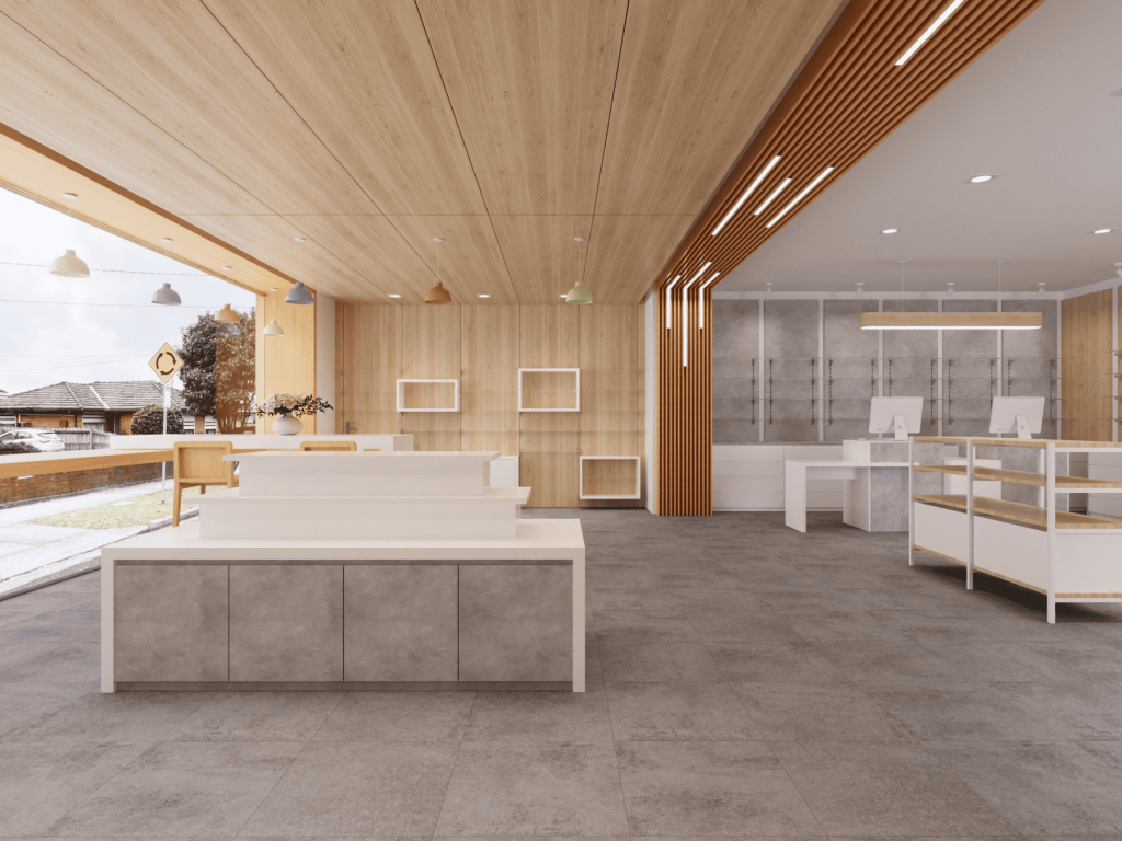
3. Durable Hygienic Materials Meet High-Traffic Retail Demands
Material selection in a pharmacy-cosmeceutical store must balance aesthetic appeal with rigorous functional requirements. The space undergoes frequent disinfection, experiences high foot traffic, and houses products ranging from fragile glass bottles to heavy pharmaceutical boxes. Four core materials address these challenges while contributing to visual sophistication.
Large-format matte cement-gray tiles form the flooring. These surfaces are slip-resistant, abrasion-resistant, and stain-resistant, making daily cleaning and disinfection straightforward. The gray tone grounds the space visually, counterbalancing the lightness of wooden elements and adding a sense of stability. Wall panels and cabinetry combine light oak veneer with matte white lacquered boards. The wood grain introduces organic warmth, while the lacquered surfaces wipe clean easily after alcohol or disinfectant application—a non-negotiable requirement for pharmaceutical retail environments.
Shelving features tempered glass panels that offer transparency and lightness. Glass does not obstruct product visibility, allows customers to reach items easily, and resists staining. Checkout counters and work surfaces use cement-textured laminate panels that resist scratches and repel dirt, suitable for high-frequency public interaction zones. Every material choice prioritizes smooth, seamless surfaces without crevices where bacteria could accumulate. This hygienic integrity meets pharmaceutical standards while the material contrasts—warm wood, raw concrete, transparent glass, and refined lacquer—create visual depth that prevents minimalist spaces from feeling flat or sterile.
4. Lightweight Island Displays Facilitate Flexible Dual-Category Merchandising
Island displays occupy the central floor area and serve as the primary navigation anchor for customers moving through the store. Their design must balance visibility, accessibility, and storage capacity without creating visual barriers.
The optimal island structure combines white metal frames with light oak shelves and base cabinets. Open upper shelves showcase high-turnover pharmaceuticals and popular cosmeceutical items at eye level, ensuring immediate visibility upon entry. Lower enclosed compartments store inventory, promotional materials, and backup stock, keeping the sales floor uncluttered. The island height remains within the customer’s natural sightline, preventing the spatial obstruction common with bulky traditional enclosed fixtures.
This lightweight configuration supports dynamic merchandising strategies. Seasonal promotions, gift sets, and trial-size cosmeceuticals can be rearranged quickly without structural modifications. The white-and-oak color scheme integrates seamlessly with the overall design language, avoiding the visual heaviness that makes conventional islands feel imposing. The transparent structure guides customers to flow naturally with unobstructed views, encouraging exploration of the entire store rather than just the area near the entrance. The enclosed cabinet at the bottom improves space utilization, hides inventory from customers’ view, and maintains easy restocking.
5. Modular Wall Shelving Adapts to Pharmaceutical and Cosmetic Display Requirements
Wall-mounted shelving constitutes the primary merchandise presentation zone, requiring maximum flexibility to accommodate products of varying dimensions—from small medication boxes to tall skincare bottles and bulk packaging.
A modular system built on metal rail tracks with adjustable tempered glass shelves provides this adaptability. Shelf heights can be reconfigured without tools, allowing retailers to respond instantly to inventory changes or seasonal assortment shifts. Glass shelves maintain visual permeability, enabling light penetration that illuminates products even at the rear of deep shelving units. This transparency also simplifies cleaning and disinfection, meeting pharmaceutical hygiene protocols.
Below the glass shelves, matte white drawer-style cabinets offer concealed storage for prescription medications, reserve inventory, or cosmeceutical samples. This hidden storage maintains wall cleanliness and prevents visual clutter. The wall itself employs a dual-material strategy: cement-gray panels create a cooler backdrop suitable for pharmaceutical displays, while wood-paneled sections provide warmth for cosmeceutical presentations. This material-driven zoning reinforces functional distinctions without physical barriers.
The modular approach eliminates the need for separate fixture systems for different product categories, reducing capital expenditure and simplifying maintenance. Glass surfaces enhance product prestige under focused lighting, while the adjustable infrastructure future-proofs the investment against evolving retail trends.
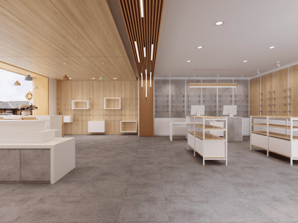
6. Integrated Service Zones Extend Customer Engagement Beyond Transaction
Beyond core merchandising areas, thoughtful integration of service zones transforms a pharmacy-cosmeceutical store from a simple retail outlet into a destination for health and wellness consultation.
The checkout counter combines cement-gray and white surfaces in a minimalist configuration equipped with POS terminals capable of processing both pharmaceutical insurance claims and standard retail transactions. This dual functionality reflects the hybrid nature of the business model without compromising operational efficiency.
Adjacent to the entrance, a window-side area features high-top tables and stools designated as a cosmeceutical trial zone and health consultation corner. This space encourages customers to test products, receive personalized skincare advice, or discuss medication questions in a semi-private setting. By extending dwell time through experiential engagement, the store increases conversion rates and builds customer loyalty.
Circulation planning ensures adequate aisle width between island displays and wall shelving, preventing congestion during peak hours. The layout naturally guides customers from entrance to checkout while exposing them to all product categories, maximizing exposure to impulse-purchase opportunities.
In Conclusion
A successfully designed pharmacy-cosmeceutical store reconciles seemingly contradictory requirements: clinical professionalism and retail comfort, hygienic rigor and aesthetic warmth, fixed infrastructure and flexible merchandising.
Through Japanese-inspired minimalism, layered lighting, durable materials, modular fixtures, and integrated service zones, retailers create environments where customers feel confident purchasing medications and inspired exploring skincare solutions. ONI Shopfitting specializes in translating these design principles into custom-built retail environments that elevate brand perception and drive measurable business outcomes for hybrid health-beauty retailers worldwide.
👉 Get in touch with us today to start your project.
📞 WhatsApp/Call: +86 186 2096 3396
📧 Email: sales1@onishopfitting.com
🌐 Website: www.onishopfitting.com
📍 Factory Location: Guangzhou, China
🔗Check out our social media case studies:Guangzhou ONI Shopfitting Limited